
[Python] 데이터 사이언스 스쿨 - 5.5 Pandas의 시각화 기능
Updated:
데이터 사이언스 스쿨 자료를 토대로 공부한 내용입니다.
실습과정에서 필요에 따라 내용의 누락 및 추가, 수정사항이 있습니다.
Pandas의 시각화 기능
pandas 패키지는 자체적으로 그래프를 그릴 수 있는 함수(메소드)가 내장되어 있다.
이 챕터에선 pandas 패키지의 여러가지 그래프를 그려본다.
import numpy as np
import pandas as pd
import matplotlib as mpl
import matplotlib.pyplot as plt
import seaborn as sns

import warnings
%matplotlib inline
%config InlineBackend.figure_format = 'retina'

mpl.rc('font', family='NanumGothic') # 폰트 설정
mpl.rc('axes', unicode_minus=False) # 유니코드에서 음수 부호 설정

# 차트 스타일 설정
sns.set(font="NanumGothic", rc={"axes.unicode_minus":False}, style='darkgrid')
plt.rc("figure", figsize=(10,8))

warnings.filterwarnings("ignore")
# 데이터 생성
np.random.seed(0)
df1 = pd.DataFrame(np.random.randn(100, 3),
                   index=pd.date_range('1/1/2018', periods=100),
                   columns=['A', 'B', 'C']).cumsum() # 누적합
df1.tail()
| A | B | C | |
|---|---|---|---|
| 2018-04-06 | 9.396256 | 6.282026 | -11.198087 |
| 2018-04-07 | 10.086074 | 7.583872 | -11.826175 |
| 2018-04-08 | 9.605047 | 9.887789 | -12.886190 |
| 2018-04-09 | 9.469097 | 11.024680 | -12.788465 |
| 2018-04-10 | 10.052051 | 10.625231 | -12.418409 |
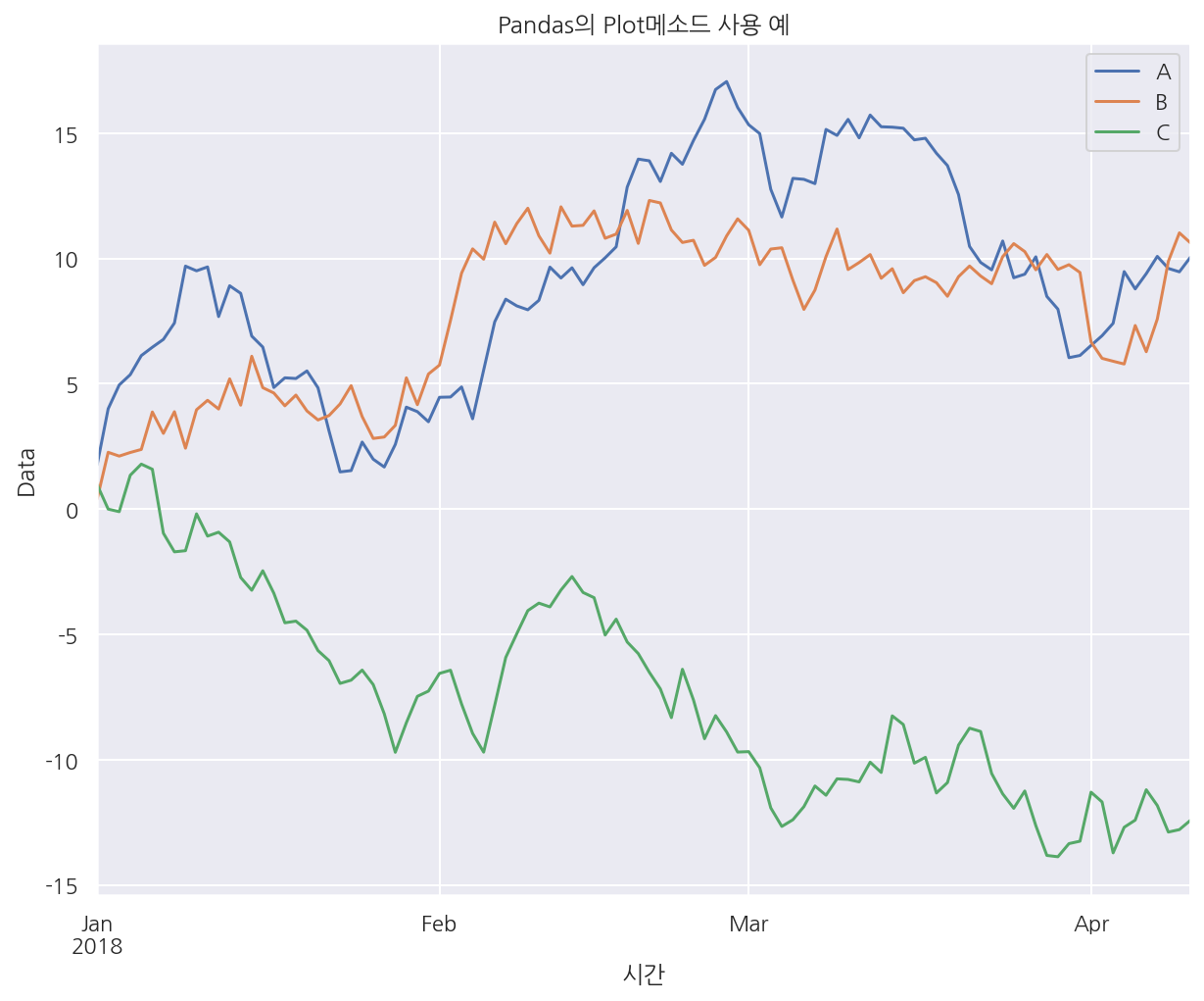
# pandas에 plot이 내장되어 있음
df1.plot()
plt.title("Pandas의 Plot메소드 사용 예")
plt.xlabel("시간")
plt.ylabel("Data")
plt.show()
# 붓꽃 데이터
iris = sns.load_dataset("iris")

# 타이타닉호 데이터
titanic = sns.load_dataset("titanic")
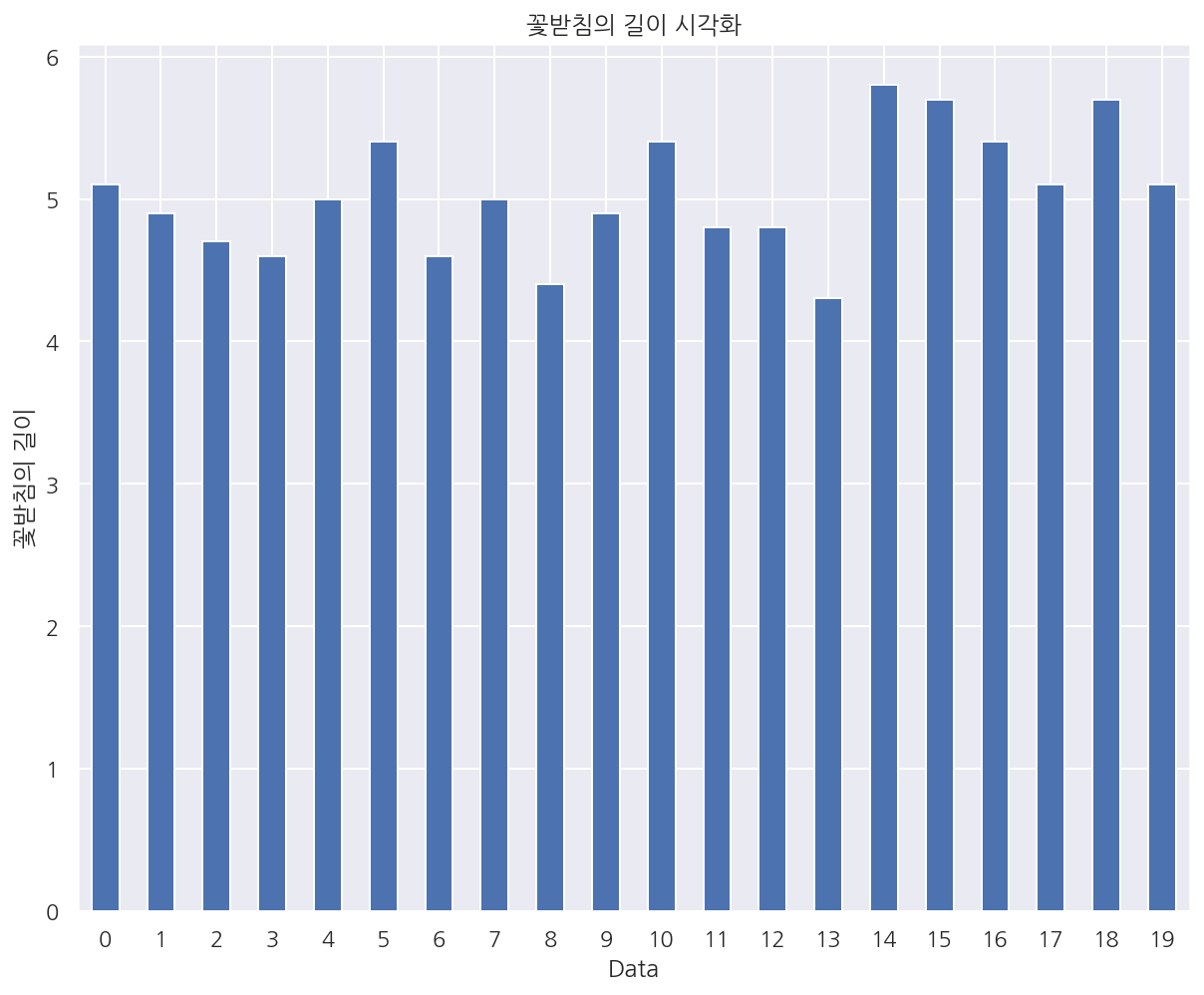
# pandas - barchart
s1 = iris.sepal_length[:20]
s1.plot(kind='bar', rot=0)

plt.title("꽃받침의 길이 시각화")
plt.xlabel("Data")
plt.ylabel("꽃받침의 길이")

plt.show()
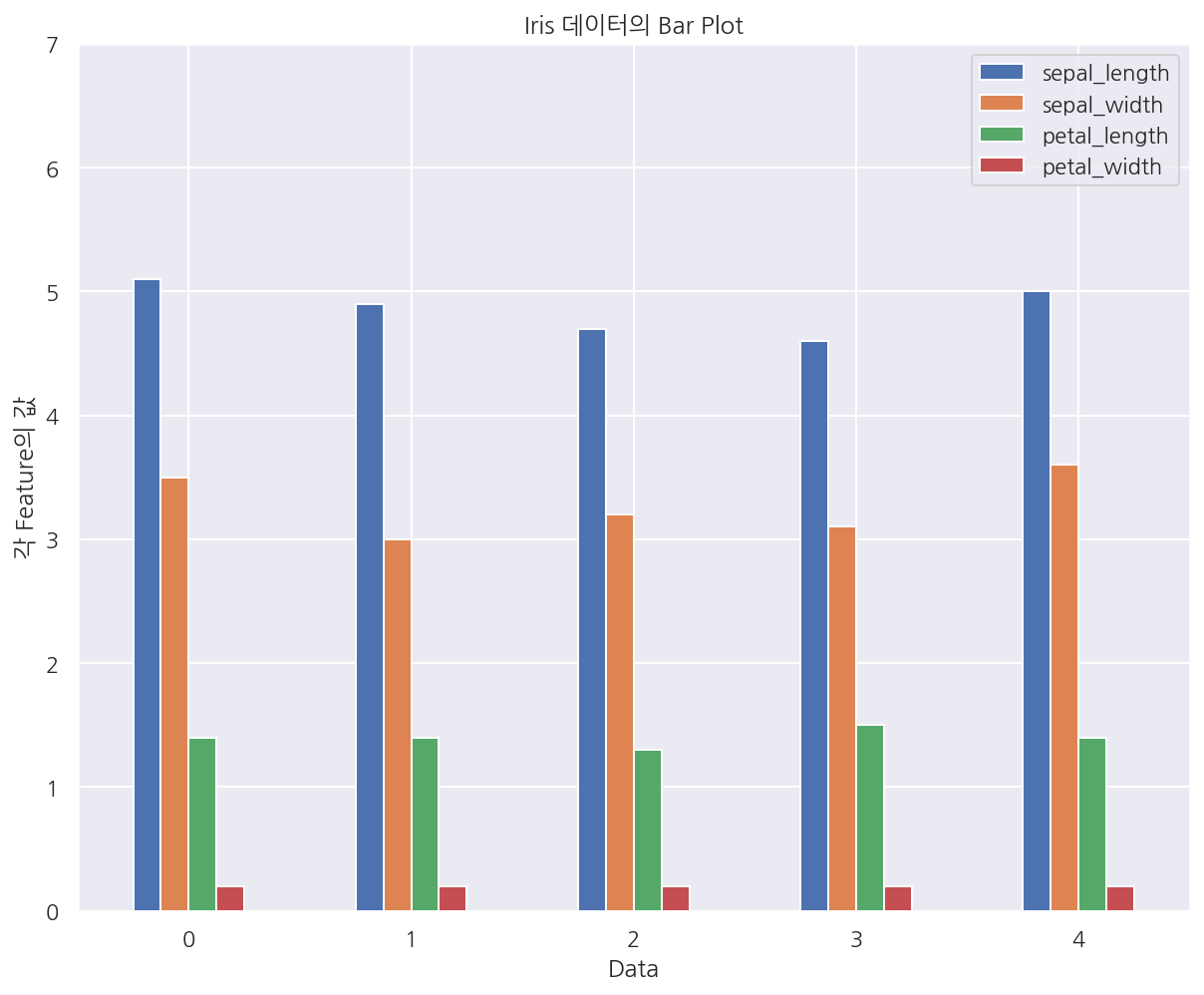
# kind 옵션이 아닌 속성으로 사용가능
df2 = iris[:5]
df2.plot.bar(rot=0)

plt.title("Iris 데이터의 Bar Plot")
plt.xlabel("Data")
plt.ylabel("각 Feature의 값")
plt.ylim(0, 7)
plt.show()
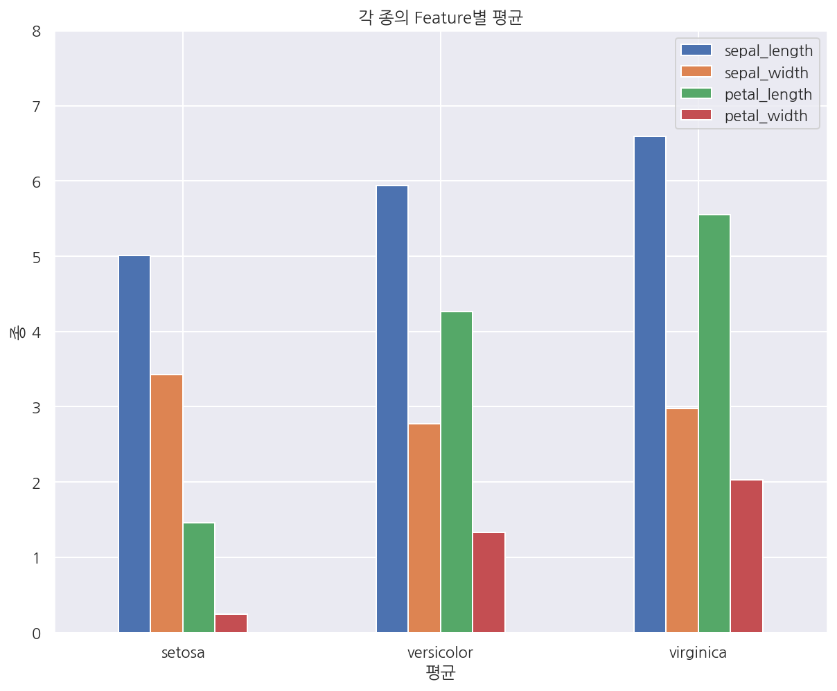
df3 = iris.groupby(iris.species).mean()
df3
| sepal_length | sepal_width | petal_length | petal_width | |
|---|---|---|---|---|
| species | ||||
| setosa | 5.006 | 3.428 | 1.462 | 0.246 |
| versicolor | 5.936 | 2.770 | 4.260 | 1.326 |
| virginica | 6.588 | 2.974 | 5.552 | 2.026 |
# index를 기준으로 x축이 결정 되는 듯 하다.
df3.plot.bar(rot=0)
plt.title("각 종의 Feature별 평균")
plt.xlabel("평균")
plt.ylabel("종")
plt.ylim(0, 8)
plt.show()
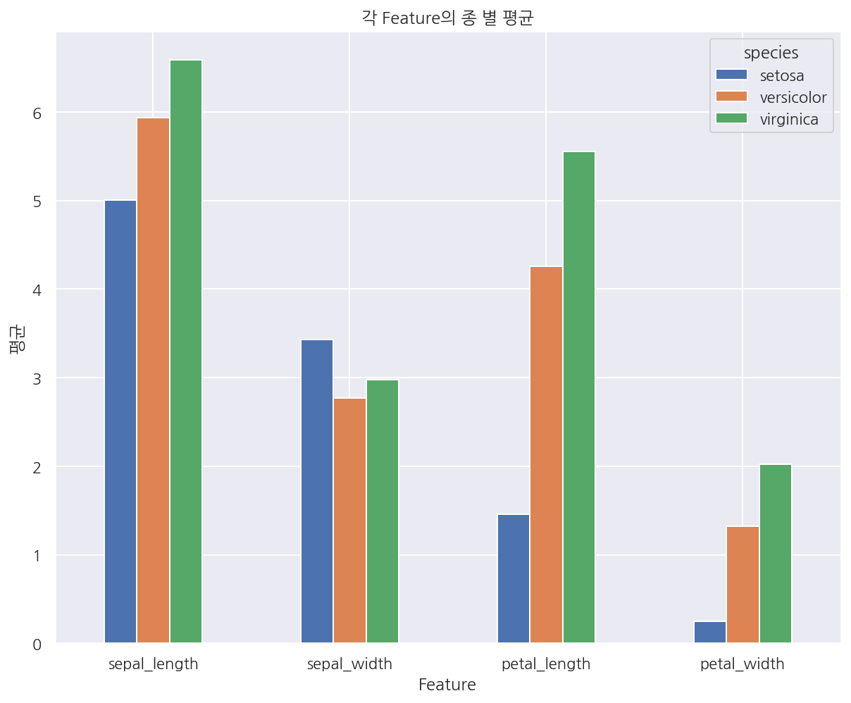
# 전치 연산
df3.T.plot.bar(rot=0)
plt.title("각 Feature의 종 별 평균")
plt.xlabel("Feature")
plt.ylabel("평균")
plt.show()
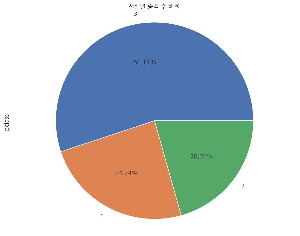
# pie chart
df4 = titanic.pclass.value_counts()

df4.plot.pie(autopct='%.2f%%')

plt.title("선실별 승객 수 비율")
plt.axis('equal')

plt.show()
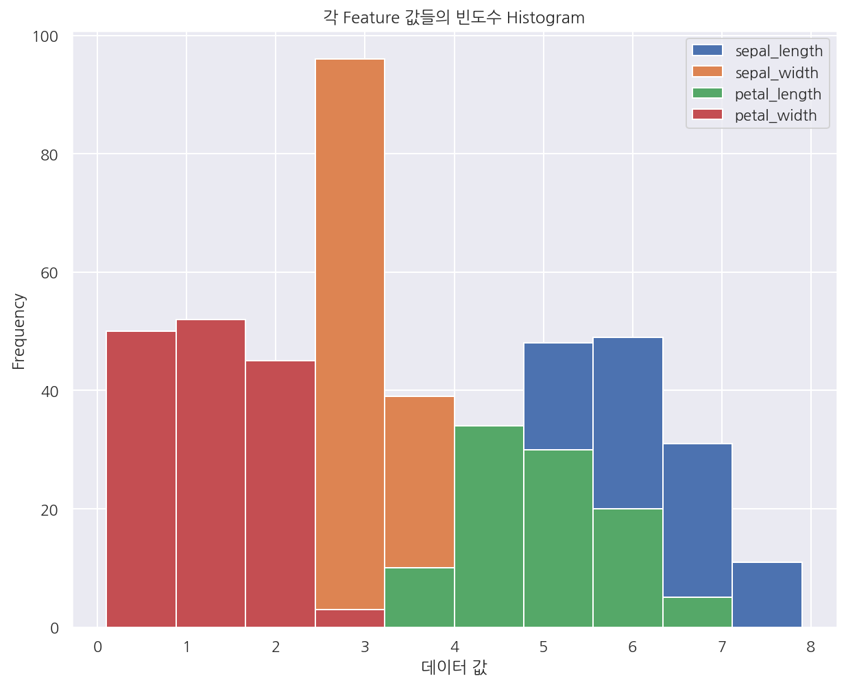
# histogram
iris.plot.hist()

plt.title("각 Feature 값들의 빈도수 Histogram")
plt.xlabel("데이터 값")

plt.show()
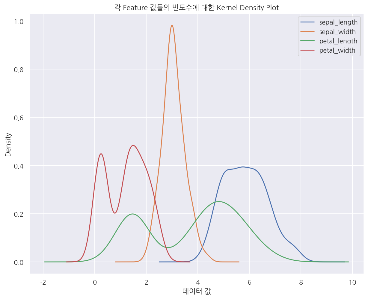
iris.plot.kde()
plt.title("각 Feature 값들의 빈도수에 대한 Kernel Density Plot")
plt.xlabel("데이터 값")
plt.show()
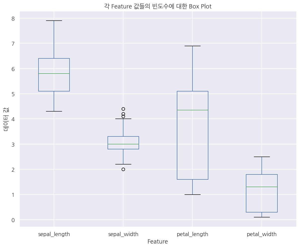
# box
iris.plot.box()
plt.title("각 Feature 값들의 빈도수에 대한 Box Plot")
plt.xlabel("Feature")
plt.ylabel("데이터 값")
plt.show()
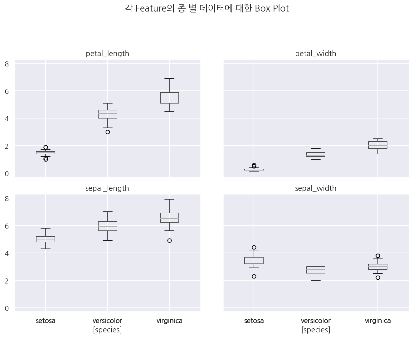
# boxplot
iris.boxplot(by='species')
plt.tight_layout(pad=3, h_pad=1)
plt.suptitle("각 Feature의 종 별 데이터에 대한 Box Plot")
plt.show()
Leave a comment